
2h ago
2 small mistakes and 1 wish
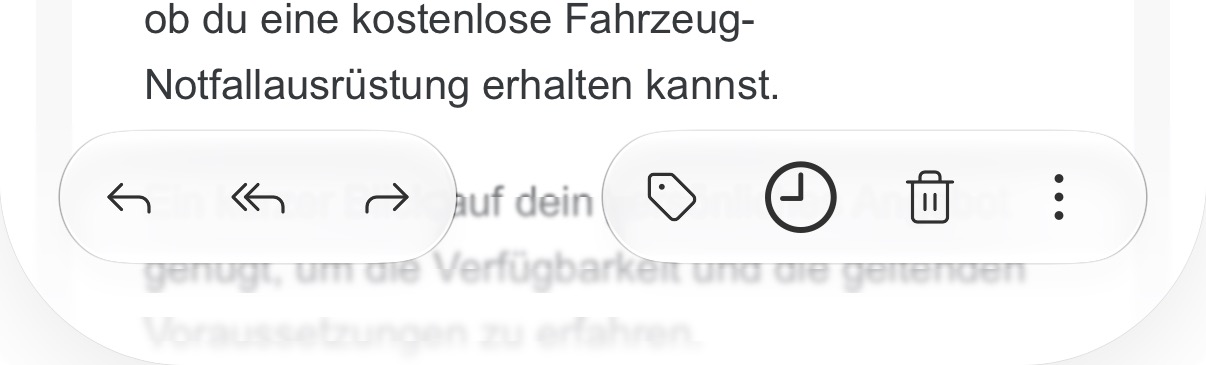
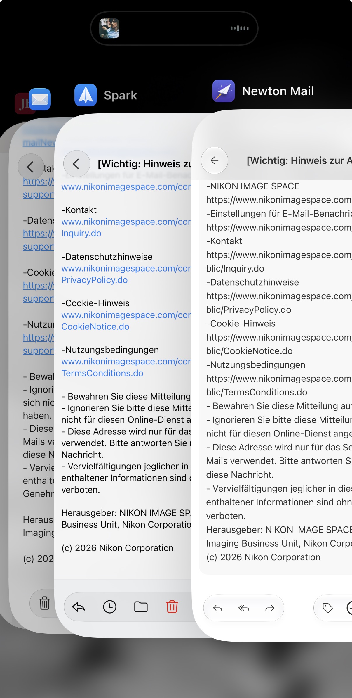
Hello. The resubmission icon does not match the other symbols. It is bigger and thicker (first sreenshoot). Furthermore, I noticed that some links are not recognized and are displayed as normal text (second screenshot in comparison). And as a third point I would like an alternative app symbol ;-) Thanks and greetings. Thomas
In Progress
I love this feedback! We’ve already started working on it. I’m not quite sure about your wish, though. What do you mean by “app symbol”? Do you mean the app icon?